The Microsoft Watch — Concept
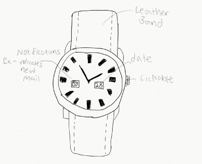
Smartwatches today are toys. Enterprise users don’t want toys. They want a stylish and functional watch. So I set design a smartwatch a CEO could gladly wear.
Background
Smartwatches today are toys. Enterprise users don’t want toys. They want a stylish and functional watch. So I set design a smartwatch a CEO could gladly wear.
Trend 1: Smartwatches are on the rise. The global smartwatch market is estimated to reach a potential $32.9 billion by 2020, with a CAGR of 67.6%.
Trend 2: Despite the rise in smartwatches, the luxury watch market is alive and well. The global luxury watch market was worth $43.2B in 2018 with a CAGR of 0.8%.
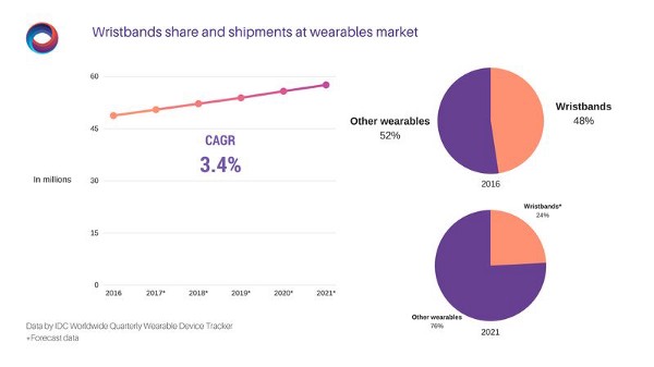
Trend 3: Why Microsoft is the perfect player to take advantage of this gap in the market. Their devices group already has experience making wearables thanks to the Microsoft Band. IDC research (see below) shows wristbands are currently 48% of the wearables market, but expected to decrease to 24% by 2021. Watches on the other hand are expected to increase from 48% to 64% in the same time frame. Given Microsoft’s identity as the B2B enterprise company, the enterprise smartwatch should be their next step.
Problems
Despite the potential at the intersection of smartwatch and luxury, there have been a surprising lack of tech companies introducing high end smartwatches. This is an untapped market. Microsoft with their productivity focused suite of software, is the perfect entrant to take this blue ocean.
Why Apple failed: Apple tried entering this market when they first introduced the 18k gold Apple Watch Edition, a $15,000 Apple Watch that the company had since abandoned. Apple didn’t understand that the market for high end watches was not the same as the market for $279 watches. The Apple Watch Edition was a toy. An expensive toy. Watch enthusiasts wanted no part of it, rightly so.
Designing the User Interface
Goals
- Meet consumer demand for a middle range watch (more expensive than “toy” smart watches — less expensive than a Rolex). The watch should have smart features, but also retain the classic look of a luxury watch.
- Supplement Microsoft’s productivity software suites by introducing a wearable companion.
- Reinvigorate Microsoft’s Devices Group by realigning wearable products with company’s new mission to increase productivity.
Non Goals
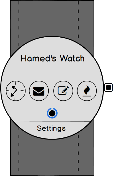
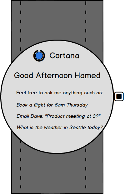
- A smartwatch that offers a suite of apps. Functionality is intentionally limited. This should be a watch first, and apps limited to those that increase net productivity.
- Act as a complement smartphone. In this design I purposely left out certain smartphone features such as phone calls and text messages. Being always connected to your smartphone was not a goal of this design. I wanted to give users a break from electronics as much as possible, so they can focus on the quintessential watch experience.
Use Cases
- Boardroom Meetings — Want a classic watch that they can wear to boardroom meetings. This watch should be elegant and stylish, but not necessarily flamboyant. Phone usage is discouraged at meetings, so watch usage should be inherently limited.
- Alarm Clock — Great for working couples who have different wakeup schedules. The watch vibrates, waking up one partner without having to wake up the other. The watch stops vibrating once movement is detected. A perfect addition for early risers.
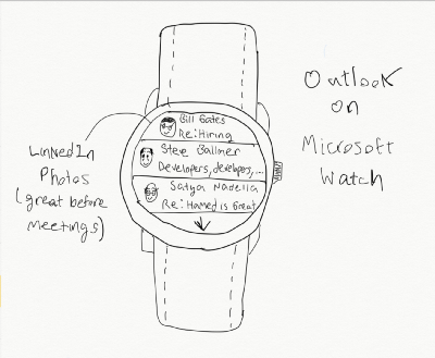
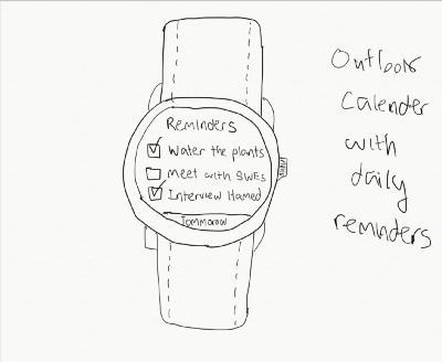
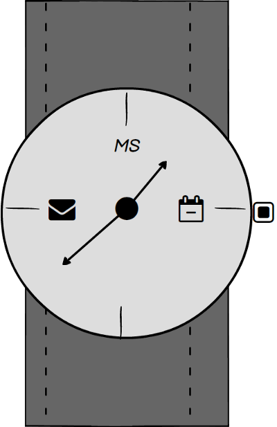
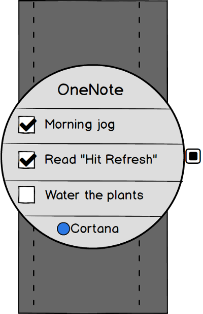
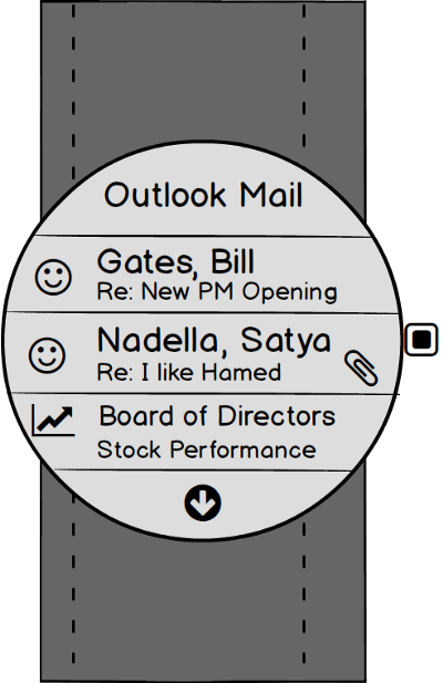
- Planner — Connected with Outlook Mail/Calendar as well as OneNote, the Microsoft Watch is the perfect way to constantly keep track of daily tasks and check the calendar for upcoming meetings.
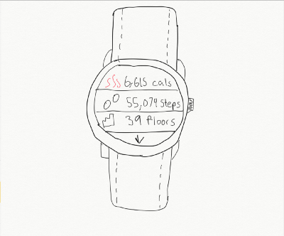
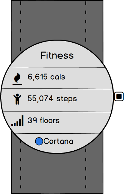
- Fitness — A healthy body and a healthy mind go hand in hand. Enterprise users understand this. Some workplaces even have office gyms. Fitness has become ubiquitous in the lifestyle of many of these power users. The Microsoft watch allows users to keep track of steps walked, calories burned, and floors of stairs climbed.
Hypothesis
Assumption 1: 20% of luxury watch owners would buy a smartwatch.
20% of $43.2B = $8.64B
Assumption 2: 5% of smartwatch owners would buy a luxury watch.
5% of $32.9B = $1.645B
Total Market: (Luxury watch owners who would buy a smartwatch + smartwatch owners who would buy a luxury watch)* % Microsoft Captures
Assumption 3: In year 1 Microsoft is able to capture 5% of this market.
0.05*((.20*43.2 )+(0.05*32.9))
($8.64B+$1.645B)*5% = $514.3M
*Note that for every 5% increase in Microsoft’s market share revenue increases by $0.5B.
Rough Scoping, Costing, Timeline
Year 1 R&D: Entire division of Device Group R&D focused on development of project Microsoft Watch. No need for new discoveries in ubiquitous computing, the tech from Microsoft band should work fine. They key research area should be design. The design is essential to the success of this project. Year 1 should focus on user research, A/B testing various designs, and QA.
Year 2 Release and Marketing Campaign: Marketing will be an important component of the success of the watch. After year 1 it should be a beautiful and elegant style piece, Microsoft’s new marketing campaign should make sure everyone knows this. It should have a coolness factor, but one rooted in style, in form rather than function. Ads should be targeted towards enterprise users, using data from Bing and Linkedin. A great way to get publicity is to give watches to high profile executives of companies that Microsoft already has partnerships with.
Year 3 & Beyond: Further R&D — this time investigating the possibility of implementing 5G features and introducing phone call/text message features. Establishing deals with mobile carriers. Adding new tools from Microsoft’s productivity suite to enhance UX. Implementation with Hololens, perhaps as a controller input.
Key Trade Offs & Decisions
- In deciding to keep the watch minimalistic, and focusing the few apps on productivity, this design forgoes the chance to introduce a new app marketplace.
- V1 of this watch design also forgoes the chance to make phone calls and text messages from the device, this was intentional. Traditional watches do not take the user away from the real world, smartwatches do. I wanted to focus on something in between, a solution that augments the natural experience rather than detracts from it.
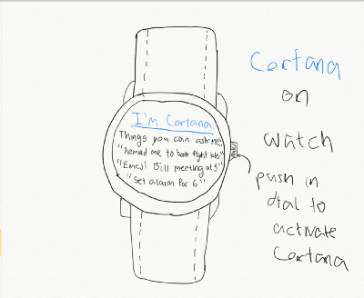
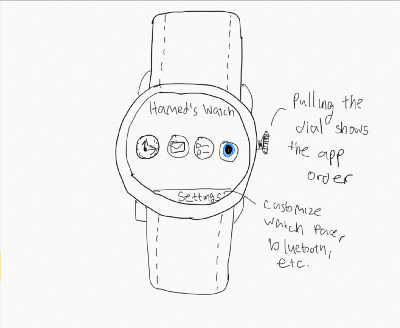
- I thought about multiple designs for a home screen for the watch. I decided on the click to view apps mode. I considered other options such as swipe to switch screen, as well as adjusting the watch crown to change the screen. Swiping the screen felt natural, and might make it to the final version in addition to the current click to view apps mode. Adjusting the crown felt clumsy and unnatural. I do think that the possibility of further use of the watch’s crown should be investigated. I am considering a feature that when the user pulls the watches crown they have a menu of different (elegant) watch faces to choose from.
Thank you for taking the time to read my concept and I hope you enjoyed my idea :)
-Hamed Rabah